HOOTERS REBRANDING
Branding Illustration

2020
But just the owls now.
As Hooters faces stagnation, I rebranded Hooters as a body-positive, quirky tourist trap restaurant chain reflecting Millenial and Gen Z humor.
As Hooters faces stagnation, I rebranded Hooters as a body-positive, quirky tourist trap restaurant chain reflecting Millenial and Gen Z humor.
RESEARCH
Historically, Hooters, as a company, has never taken itself seriously. The restaurant opened its first location in Clearwater, Florida on April Fool's Day in 1983 by six friends with no restaurant experience. Since then, the company has poked fun at gender using innuendos and wordplay. Hooters positions its waitresses as “not like other waitresses”.
They are entertainers and team players. Each wears a recognizable white tank and orange shorts. They serve men of all ages (young and old). Not to mention, there’s wings too!

IDENTITY
Old vs. New
For the new identity, I drew inspiration from the original Hooters logo, which uses a detailed illustration of a Great Horned Owl with rounded text over the eyes. I saw an opportunity to create a flexible logo that uses different owl illustrations as a nod to the 80s trends.

Mood Board
In my mood board, I focused on post-modern Gen Z humor. Post-modernism, as a modern art movement, is self-referential. It questions reality and representation.
For my rebrand, I wondered, “What if Hooters is just about owls? Not about the girls.” Many of us, we have memories of our fathers and older generations going to visit Hooters for “booze and the wings”. In my Hooters mood board, I included images from Finding Nemo and Frootloops, altered to be more realistic and literal. I also included cartoon illustration of the Hooters girls and comics to serve as texture and personality.


UNIFORMS
The colors still remain the same, but I created versatile options for waiters and waitresses to mix up their look in the restaurant. The shorts are longer and baggier in length.


KID’S MENUS
Believe it or not, Hooters does have a kid’s menu.
I am not sure why they do, but I believe Hooters is trying to change their image to be more family friendly and inclusive. Below, these are are children inside the restaurant circa 2017–2018.


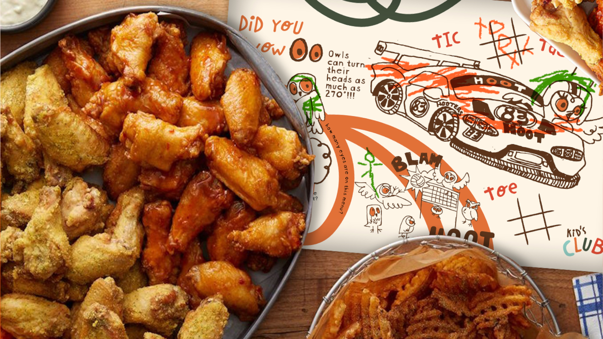
For the redesign, I wanted to include coloring book style illustrations of the food and owls. The front and back include owl trivia, tic-tac-toe games, and the owls scattered throughout the page.


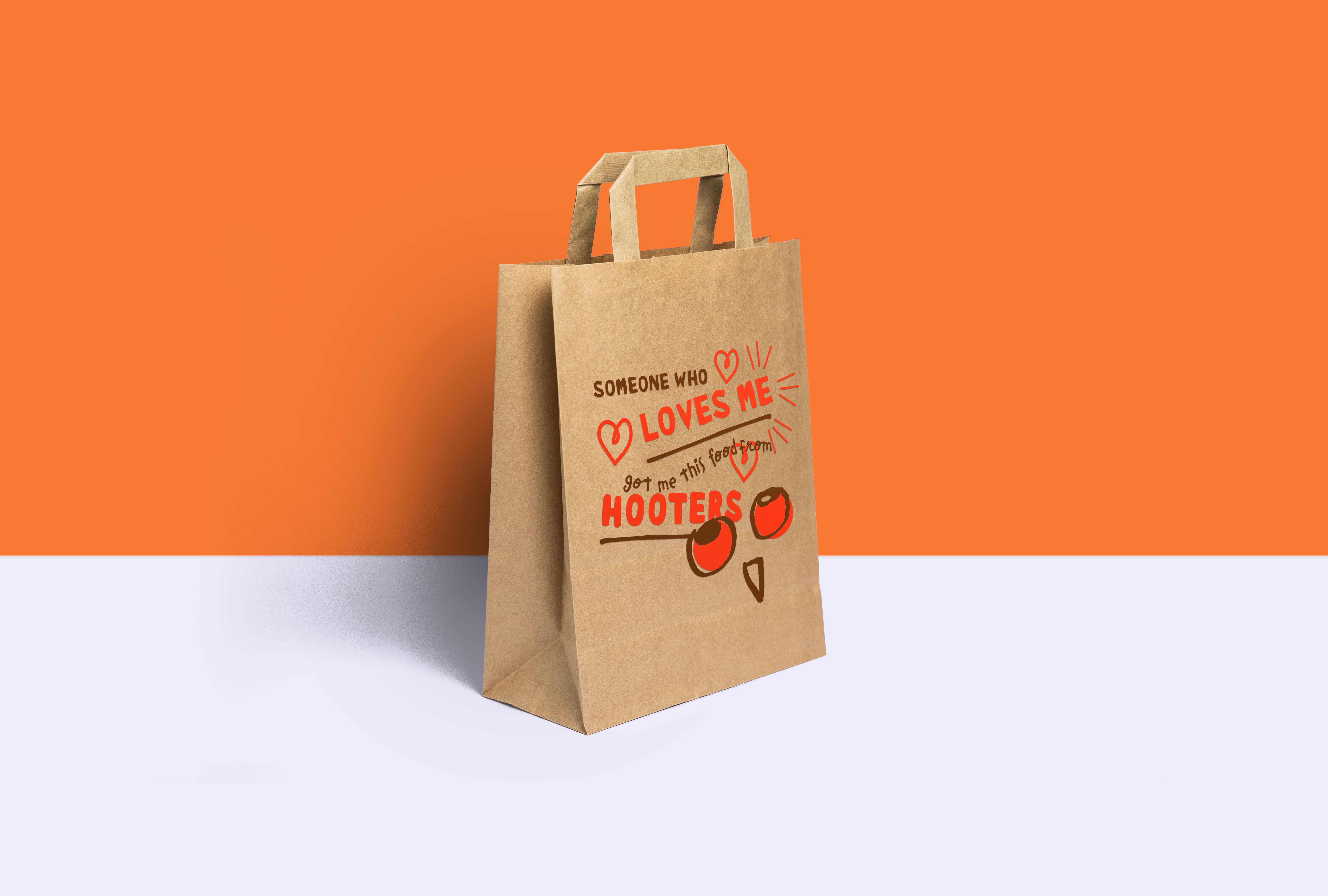
MERCHANDISE


