Rubin Museum of Himalayan Art: Image Cropping Guidelines for Sacred Art
Content Design
2024
A cultural sensitivity training presention for onboarding new hires & communicating guidelines for third-party vendors
About The Rubin
The Rubin Museum of Art is known for its diverse array of art from the Himalayan region, comprising sacred and religious artworks. Internally, the staff maintains open communication with the Himalayan community and representatives to ensure the artwork is respectful. This includes being mindful of the representation of symbols, objects, gestures, and deities.
Wheel of Life; Tibet; 18th century; pigments on cloth; gift of the Shelley & Donald Rubin Foundation; Rubin Museum of Art; F1997.40.10 (HAR 591).
Lack of Guidelines Leads to Misrepresentation
When the Museum works with universities and third party vendors, the Museum will try its best to oversee the marketing assets. However, there are sometimes gaps in communication and it has led to misrepresentation of the collection in collateral.
In print
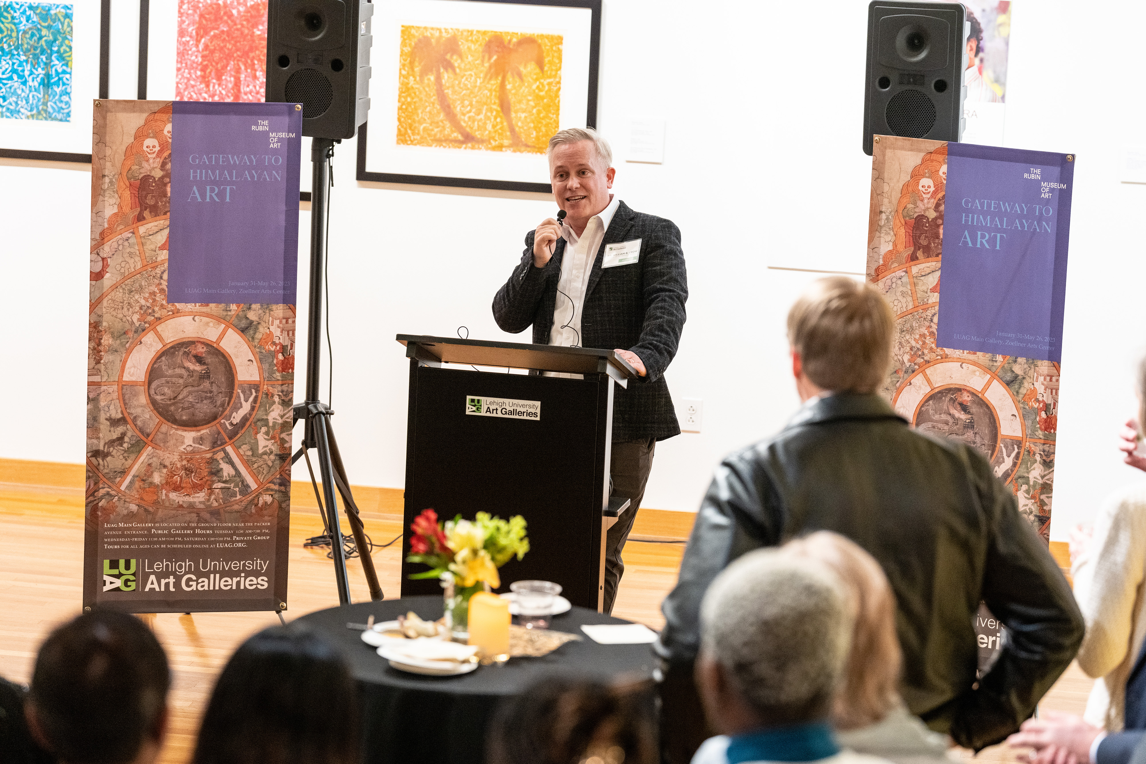
For example, below, in 2023, these were banners designed by Lehigh University to promote the Rubin’s ongoing traveling exhibition Gateway to Himalayan Art. The graphics cover the face of the Lord of Death,Yama. By covering Yama, important information including the deity’s skull crown and facial features cannot be recognized or deciphered. In Buddhist culture, it is important for a deity to be recognizable to the viewer and it best practice to show as much detail as possible to permit recognizability.

Banner display at Lehigh University shows a deity and mandala split in half across the face
In virtual spaces
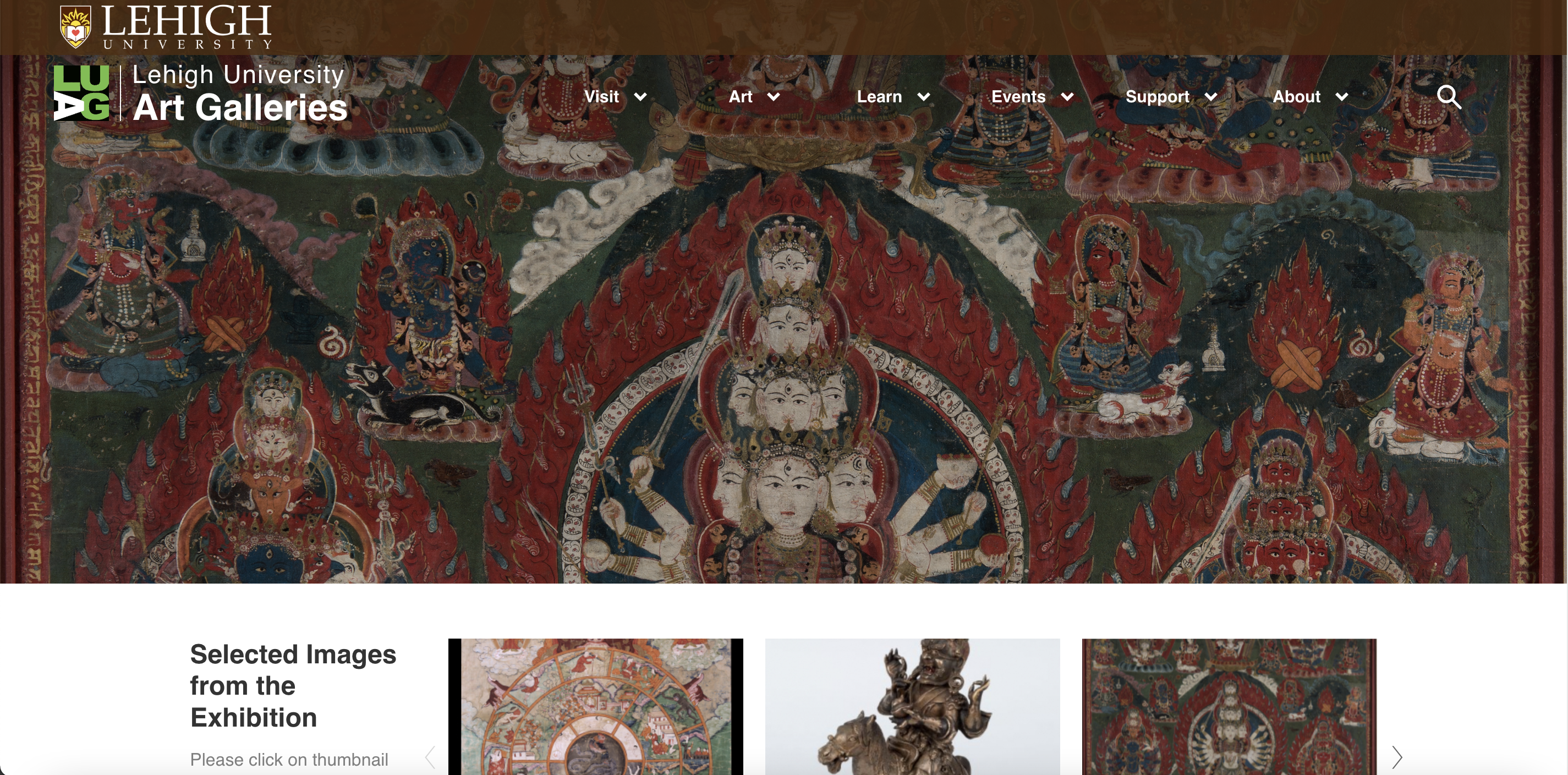
The same issue appeared on the university’s website, when it advertised the exhibition. You’ll notice deities are cropped in half and website graphics cover their heads.
The Museum recognizes that this websites can automatically crop images, but they need human oversight to correct misrepresentation.
 The original Gateway to Himalayan Art Lehigh University website
 Research
Identifying where misrepresentation happens
I worked together with a cultural consultant and the Museum’s curators to ensure the document can be evergreen and applicable to different scenarios in the workplace. As part of my research, I made a preliminary list of common places where images appear in physical and virtual space, keeping in mind a user’s workflow to complete a task.

Using symbolism and typography to create cohesive language
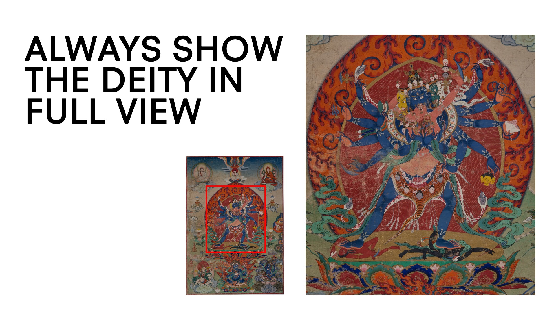
For my presentation, I used simple typographic color coding and overlay to communicate errors.


I mimicked the act of cropping by reducing the size of a full size painting and enlarging the “cropped image”. You will also notice a red rectangle is used for the crop symbol.
Implementation
With guidelines, paintings can be represented with full information without leaving out details.
Lehigh corrected the original website to better represent the deities and objects in the exhibition.
Before![]()
![A screenshot demonstrating the Lehigh University webpage before revisions]()
After![]()
![A screenshot featuring the Lehigh University webpage incorporating revisions]()
In the previous (left), I mentioned there are limbs and faces missing from the crop. In comparison, in the updated version, you will notice the main deity in the header (right) is shown from the waist up and all arms and hands are shown in full to demonstrate the objects it holds to allow viewers to identify them. It is also displayed again in another smaller image in full context.
Conclusion
Cropping serves to hone in on details of a photograph and/or work of art. It can offer information that we would not otherwise see in a full image. However, we must be mindful to not cut out all details because it can misrepresent the context and meaning of a painting.
Opening dialogue & Next steps
This digital project opens up the dialogue for conversations related to automatic cropping and facial recognition. As the Rubin continues to evolve its digital presence, I want to explore these technologies to train software to reconize deity figures and generate backgrounds for sculptures. I believe human correction will be needed to assure the cropping is respectful to the original work, but it can improve productivity.


